
Ellie arrived almost exactly on time a week ago on 28th December, just in time to guarantee that her birthday will always be part of that happy hazy period after the Christmas rush but before the New Year and all of its good resolutions.
As we have known that she was to be Ellie for some time, I've had the perfect project picked out for her since the autumn, and had the yarn in the house since the beginning of December. Despite all of that, she still arrived before I had so much as cast on. Oops.
On the plus side, this isn't exactly a gift where fit matters - it's the L-blocks Baby Blanket from the Debbie Bliss Vogue magazine issue 1:
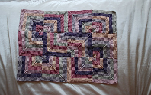
I cast on on New Year's Day and finished late on 3rd January - this first finished object for 2009 is a speedy knit and no I wasn't knitting non-stop in between!
My test subject declared it soft:
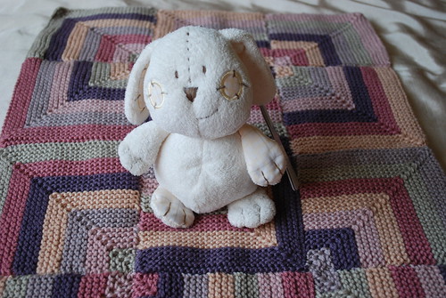
And snuggly:
So I hope that she will like it. The colours suit Ellie's mother's colouring really well which was why I picked it out but I think that it is sufficiently muted to suit a little red-head.
Speaking of colours, if you ever wanted a lesson in textbook colour context theory, this is it. I knit this blanket to the colours of Debbie Bliss Cashmerino Aran specified in the magazine; Dusty Purple 17, Mauve 20, Blush 21, Carnation 603, Peach 22 and Stone 102; and the pictures above look exactly like the ones in the magazine.
The colours of the some of the balls of yarn look totally different:

Would you guess that this one was the one that looked green? And that really it was called Stone?

Or that this is the yellow, otherwise known as Peach?
No, me neither. Basically, our perceptions of colour saturation and luminescence changes depending on what colours are put together and can be totally altered by a different shade.
Colour theory says that our eyes are engaged by visual contrast and so our brains naturally seek it out. If you put a grey blob on a purple background it will look more yellowy than the same grey on a green background (which will look red) or a blue background (which will look orange). It's still grey but with a slightly different tint.
The brain is picking up the part of the grey with the most contrast to the background colour, ie the colour opposite to the background on the colour wheel, and that's pretty much what's happening here - the green tinge to the stone coloured yarn is roughly opposite the pinky red colours prevalent in the blanket, and while the yellow that you see is not opposite the purples and pinks, it is nudged a good way further around the colour wheel. We pick up on the tinges in the yarn that give the most contrast.
What makes it even more interesting is that there's no way of telling how anyone reading this would actually interpret the colours in this blanket - it's all person specific!
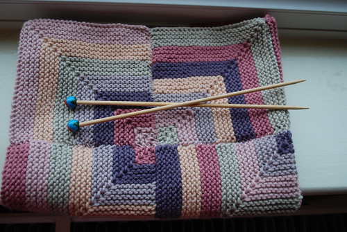
What I do know is that (a) I think the colours in this blanket are pretty, regardless of how they appear in the ball and (b) I got to knit it with my current favourite needles:

It seems rather appropriate to be marking Epiphany with a gift for a baby.
I wish you a happy 12th night and peaceful re-entry to the real world.
Beautiful blanket! I think those colors go very well together (at least the ones I'm seeing)! And interesting 'lecture' on color...I sort of knew that it occurred but never really understood why. Pretty fascinating!
ReplyDeleteA nicely matching colour blanket !
ReplyDeleteU did weave the ends well !
I need some warm yarn for my next winter holiday, is cashmerino warm enough ?